Quick look at my current work at Telstra Health.
(I constantly updating this page)
My first role at Telstra Health was a UX Researcher, back in May 2016. I helped prepare a research plan and recruiting the participants for Telstra Health website's usability testing. I was also responsible for leading the experience design optimisation for three other Telstra Health products called Care Plan Connect, Travel GP and HealthGateway. At Telstra, you have to move fast but efficiently. Luckily enough, I got to work on other projects as well. I helped improved other Telstra's products such as Wideband, Partner Portal and Smart City.
I was invited to be a full-time Lead UX Designer for a small team called P.I.P (Patient Interaction Platform) at Telstra Health in October, 2016. This role required me to design and develop a consumer-facing platform experience. This integrated mobile app is called HealthNow.
I was responsible for strategising the app design end-to-end. I used design thinking in a agile environment to craft the experiences and managing the design assets from discovery > design > development > delivery phase. Design activities include; UX strategy, competitors comparisons, tasks analysis, features assumptions, building user flow and information architecture (IA), user research, lo-fi and hi-fi prototypes, accessibility and usability test, art direction and creating a clean pleasurable interface design.
As a HCD advocate I encouraged the whole team to empathise and learn from the end users. I helped my team to understand and embrace the HCD process by prioritising usability and accessibility testings. To date, we've done accessibility testings with a visually impaired user. I led the usability testings for HealthNow key features such as: outpatient appointments, script ordering and telehealth. We turned the findings into actionable tasks for development. I outlined my process below.
The HealthNow appThrough task analysis, we had gone several iterations of structuring the main features on the app. HealthNow has 9 core features all together that suited to the use cases summarised below.
We found that users are not keen to dive deep to find features that are important to them. As a solution, we decided to create a dashboard, giving equality to all the features that are important to users as well as to the providers. Based on our primary feedback, the health providers highly valued that their logo appears on the dashboard. This approach also provide brand-trust, easy recognition to users to remember which providers they are connected. 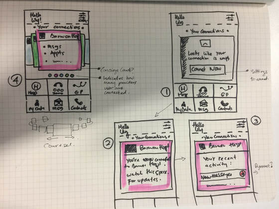
|
|
|
What is HealthNow app and value proposition
Our research shows that, there is a need for Australian to get a GP or doctors consultation without leaving their home and to get access to better understanding of the medical and health information, managing appointments, medication in one platform. We also identified the needs for family members to share their health providers to their loved ones in case of emergency. In summary, HeathNow helps to connect a patient and a doctor or a specialist at the comfort of their home through integrated telehealth support. HealthNow also connects Australian healthcare consumers with their government medical records, managing outpatient appointments and ordering prescriptions, all in one free mobile app. |
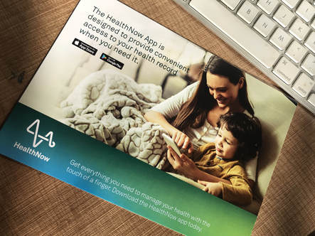
Learn more about HealthNow: https://www.healthnow.io/
|
How I execute design tasks
Coming from art and design school, using design thinking and prioritising the end users is a natural practice for me.
In my team, I worked closely and collaboratively with engineers, a business analyst, scrum master, testers, a product owner and a general manager. We practiced agile . Aligned to HCD, I treated everyone in my team as a designer. I encouraged them to speak and draw their ideas along.
Working as a sole designer, I had to move fast, strategised efficiently managing the end-to-end design process inclusively, from discovery, ideation of the experiences to the devlivery phase. This not limited to how it looks, but how it functions (back-end and front-end).
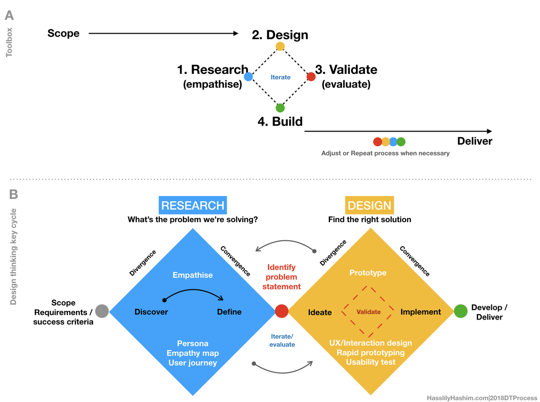
Using design thinking as my toolbox, I strategised the process into 2 main cycles: A) Research and B)Design. These two are interchangeable depending on situation as depicted by the following document.
In my team, I worked closely and collaboratively with engineers, a business analyst, scrum master, testers, a product owner and a general manager. We practiced agile . Aligned to HCD, I treated everyone in my team as a designer. I encouraged them to speak and draw their ideas along.
Working as a sole designer, I had to move fast, strategised efficiently managing the end-to-end design process inclusively, from discovery, ideation of the experiences to the devlivery phase. This not limited to how it looks, but how it functions (back-end and front-end).
Using design thinking as my toolbox, I strategised the process into 2 main cycles: A) Research and B)Design. These two are interchangeable depending on situation as depicted by the following document.
How I collaborate with team and communicate to developers:
Empathy is king in every design process. This includes understanding how the developers work what they need and how I could support them. Below are designed and tested screens ready for my team to developed. I used Zeplin to communicate and collaborate with my team and developers. I used InVision to produce clickable prototypes.
2018 - In development:
Script ordering: https://scene.zeplin.io/project/5aefe5f34deeb1e15228d887
2017-2018 - HealthNow features:
Sign up: https://scene.zeplin.io/project/5a55428e55ac702fce4ed79d
Dashboard: https://scene.zeplin.io/project/5ade5d4bfa65b16901f9c855
Notifications / inbox: https://scene.zeplin.io/project/5a78df65b4f9042214badcf8
Connect to a provider : https://scene.zeplin.io/project/5a4ebaf86f0b74a4cfa997e2
Emails: https://scene.zeplin.io/project/5a569b190cb61e07915327bb
2016-2017 - HealthNow mobile app releases:
R4-R5: https://scene.zeplin.io/project/589ba9739e603a741d571691
R2-R4 : https://scene.zeplin.io/project/5819042a075321c301dd2d17
2016 - Early work at Telstra Health: Care Plan Connect & Telstra Health web based registration:
https://scene.zeplin.io/project/575625625a167ff426486670
Case study 1: Outpatient appointments
User research and usability testing example
User research and usability testing example
|
Feature: Inbox and message details
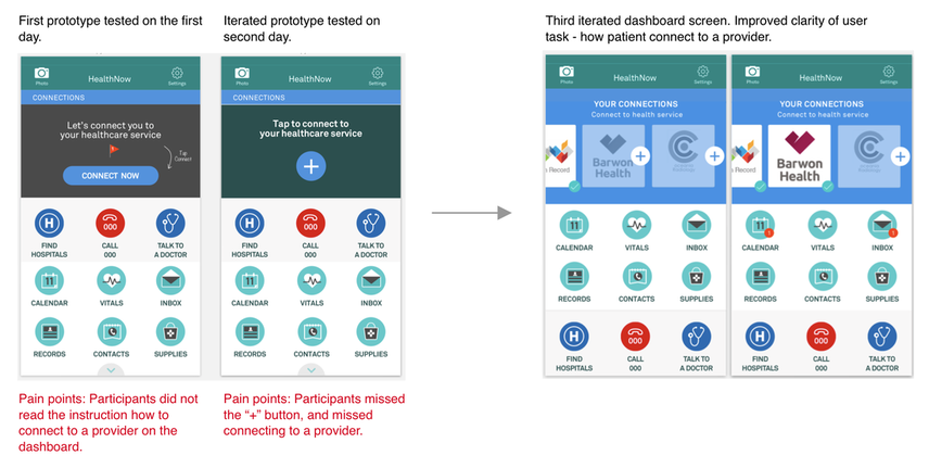
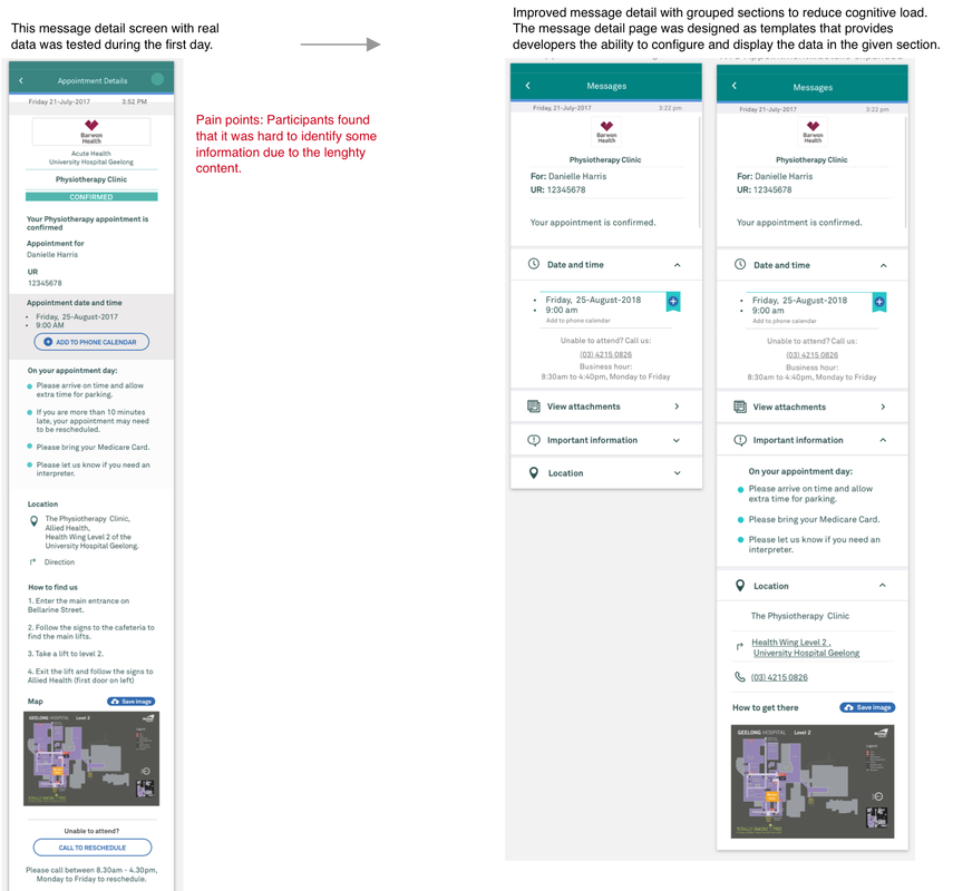
Design activity: Usability testing I led the usability testing helped by two other designers and our product owner. We run a heuristic usability testing with 20 participants within 5 days at Barwon Hospital and did rapid design iterations in between the testing. Problem: The hospital is interested to use our app to replace the paper-based appointment invitation and confirmation to their patients. We were given the current hospital-patients work flow. The digital version needs to resemble this experience in a simplistic but informative way to increase attendance rate. Value: To optimise outpatient appointment experience digitally rather than paper-based, to reduce the "DNA (did not attend) rate. Method: Ethnography - We set up a "booth" in the audiology clinic which patients could volunteer to participate in the usability test. Personas: Parent(s) with a toddler(s), elderly couples, single elderly, young professionals, Outcome: We gathered some aspirations from the participants through empathy focused questions before the test begin. We tested how well participants perform the task. Clarity of UI elements, how well the UI communicates to participants were also tested. The results showed that patients valued the outpatient appointments feature, but some of the journeys and tasks that were not very clear to them. We iterated the user flow as well as the UI component focusing on the pain points, and run another rapid usability testing for the next 2 days before presenting the outcome to the whole team. Design and development progress: This inbox and message details feature for outpatient appointments have been fully developed. |
|
Some examples of iterated and improved key screens based on the findings:
Post-usability testing
Design activity: Team workshop - Mapping user experience by outlining the pain points.
Design activity: Team workshop - Mapping user experience by outlining the pain points.
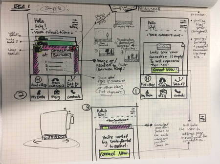
Based on the findings, I mapped the experience emphasising the pain points and took it into a workshop with the rest of our team mates. This exercise gives visibility to everyone rather than having to deep dive into the research document.
1) Mapping the pains and gains of patients' experiences gathered through the usability testing between prototype 1 and the iterated prototype 2 as shown below:
1) Mapping the pains and gains of patients' experiences gathered through the usability testing between prototype 1 and the iterated prototype 2 as shown below:
2) Experience map measured against the third iterated prototype:
3) Scenario based experience journey for onboarding patients to connect to a provider (Barwon) using Hook principles.
Case study 2: Script ordering
The following is another set of usability testing I planned, run, and managed from beginning towards the development process:
The following is another set of usability testing I planned, run, and managed from beginning towards the development process:
|
Feature: Script ordering
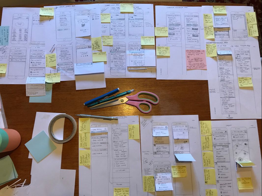
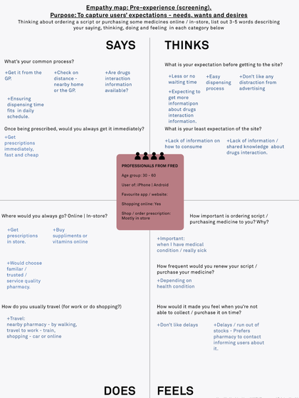
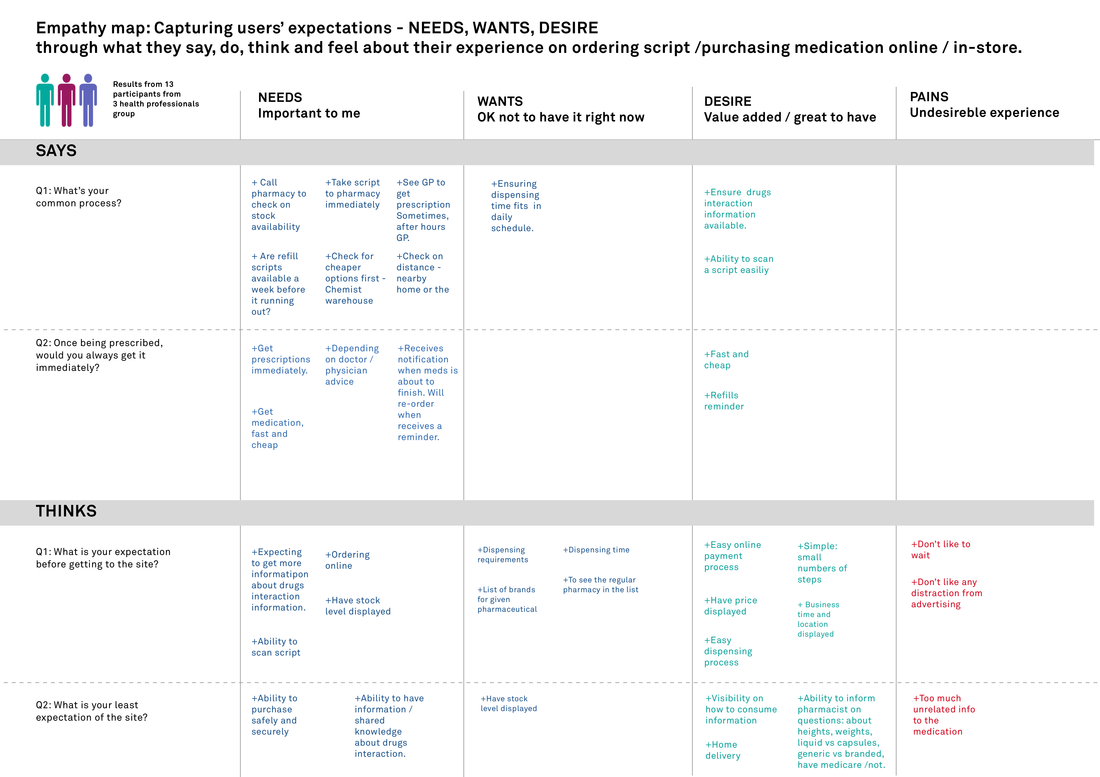
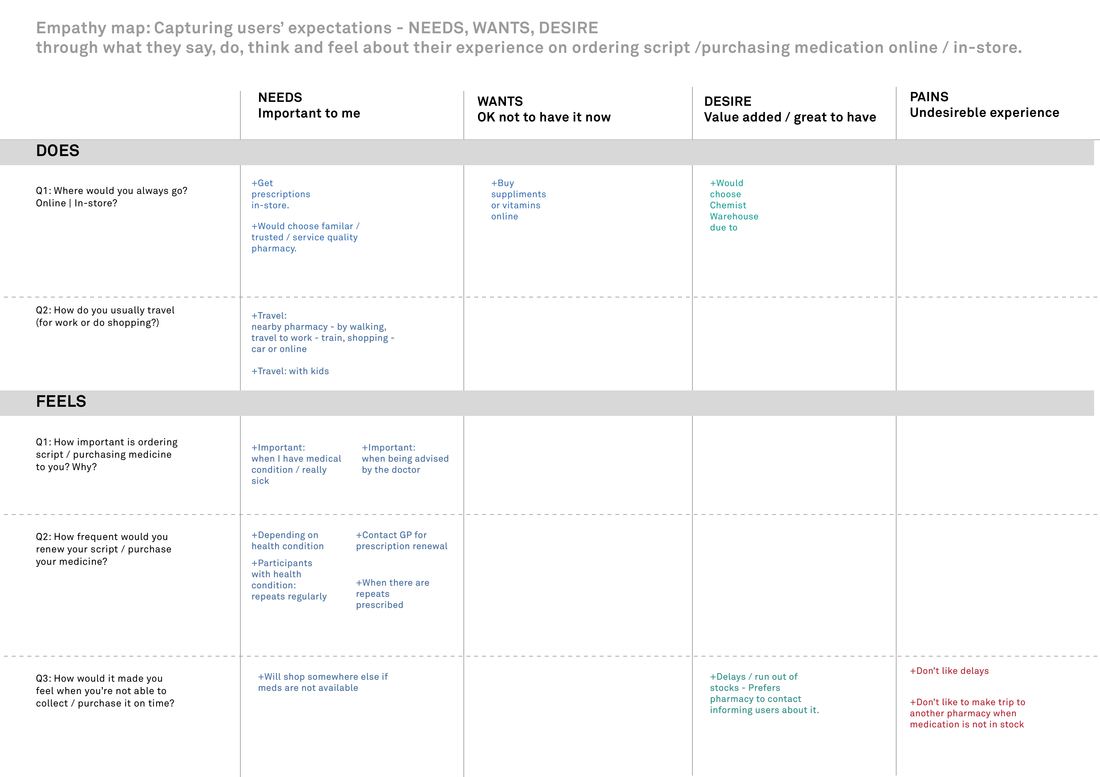
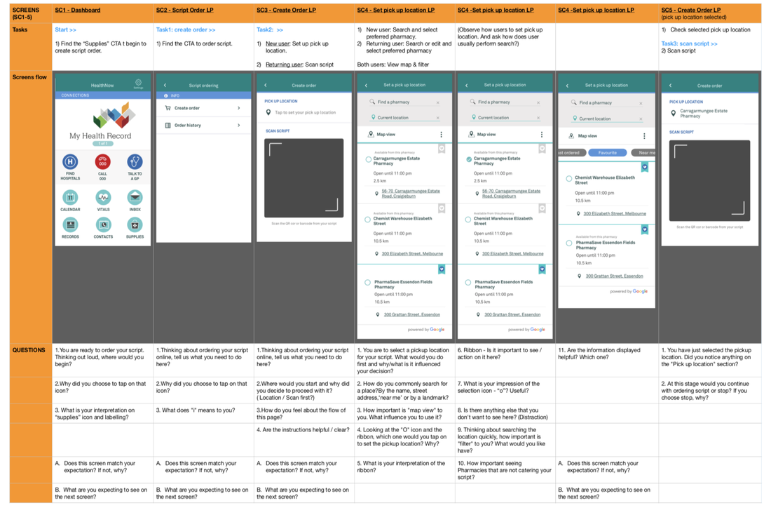
Design activity: User research and usability testing This is the prototype I used to run the usability test looking at both tasks analysis and heuristics usability. Paired with a front end developer I led the test. We tested this prototype with 13 participants. Preparation prior the test includes: Hi-fi InVision prototype, usability testing script, empathy map and questions, persona card, participant recording consent form, questions set with task flow and screens, feedback form with task flow and screens. Problem: We integrated with eRx Express. The current eRX Express capability only cater for single script order. eRx capability faces complex user flow and poor pharmacy finder through their map. Value: HealthNow proposed to optimise eRx Express experience by enable patients to submit more than one script order. This approach create opportunity of enhancing the user flow, reducing complexity whilst giving better pharmacy finder experience via maps. Methods: With the assumptions that we know based on the current workflow (front and back end), I created a prototype and planed for a hybrid of user testing and usability testing. Persona: We tested with 13 participants consisting of single patient, patients with family and patients with health condition. Majority of them preferred to order their script online. Their motivation to use this feature if it reduces their waiting time at the pharmacy by ordering it in advance. Outcome: After 3 rounds of research with different groups of professionals from 3 different companies we iterated the flow making the experience fast and neat. I run team workshop to present the findings. I also run user journey refinement with the team to make sure the experience can be built. Script order feature was developed based on priority provided by the product owner. |
|
Hybrid empathy map + persona.
I used this template as the ice breaker prior running the usability test.
I used this template as the ice breaker prior running the usability test.
|
How I mapped the findings:
|
How I set the usability testing questions and designed the feedback sheets
Communicating findings to the team
It can be a challenging task when trying to communicate findings to the team whilst making sure that everyone engage and participate in the discussion. I've experimented many ways of presenting the outcome. For script Ordering feature findings, I applied simple and fun approach.
Design iterations for development
I usually make an observation on the level of comfortability of my devs team to work with my design. It is crucial to get everyone to participate in the design discussion so that everyone feels empowered by contributing their thoughts and ideas. As a designer, I must support my devs team by understanding their concern about each interaction points. Happy days and not so sunny days flows were discussed and prioritised in a full day design thinking workshop. For the script order design process, I used the paper-based prototype to give an opportunity for everyone to improve the design guided by the research findings. As a result, the devs team felt relax and comfortable to provide so much input as opposed to the digitised version of wireframes.
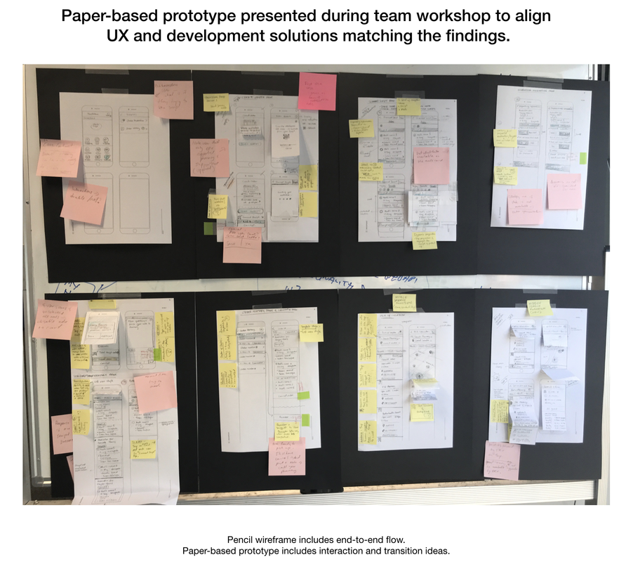
After all feedback and consideration had been gathered, I quickly iterated the prototype before digitising them for the font end dev to start building the working mockup.